Starting April 16, student users of Banner, Dartmouth’s student information system, will see an improved landing page for academic and personal data, including the admission process, financial aid, course registration, and grade information. The new entryway is called DartHub.
“The Banner experience has been radically improved,” says Associate Chief Information Officer Alan Cattier. “Our redesign process has encouraged students to provide input, so that now we have an interface that’s a more natural gateway for all users to navigate through systems that are most relevant to them, at the times they need to give or receive information.”
Cattier says the push to improve Banner’s gateway came initially in 2013 from Improve Dartmouth, a crowd-sourced suggestion forum. A computer science class also recommended ways to make the entry to the website more useful and less cumbersome. “Once those ideas got rolling,” Cattier says, “we also talked with nonstudent users—the registrar’s office, faculty, staff, and all the graduate schools—about how to make Banner better.”
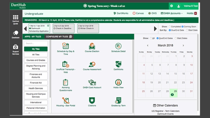
Tom Joseph, a senior programmer for Information, Technology and Consulting (ITC), says the redesign team learned a lot by taking prototypes to the Dartmouth Library, inviting people to beta-test the DartHub page and offer instant feedback. In place of a long alphabetical list of student record sites, there are now colorful tiles leading users to different sites for academic and personal information. Tiles can be reconfigured on the screen to reflect a user’s priorities.
“The interface is divided into two sections,” says Joseph. “An alert section at the top of the landing page displays time-sensitive actions that are relevant to a student, like class registration.” Below it students will find applications with less-pressing deadlines, such as requesting a transcript.
Amy Hunt, academic systems technology manager in the registrar’s office, says the redesign of any established tool can be a challenge. “Some students ask for some things, while others want the exact opposite. We find that a smart approach is to keep it simple, and add more functionality later when users have had time to work with the new interface. We tried to do this with DartHub.”

Joseph says some of the best self-service features of DartHub came directly from student feedback. “For example, the concept for the alerts was to provide notice that something was upcoming, or due, but the first version didn’t allow students to mark a task as completed. Our testers told us, ‘If you are going to give us a to-do list, then let us mark it as completed so we don’t keep getting reminders for something we already did.’”
The revamped page also adds information students ask to see on a daily basis, such as how many card swipes are left on a meal plan.
“Our hope is that with DartHub’s unified view and intuitive, user-centered design, the Banner ‘scavenger hunt’ to find and select the right menu item is gone,” says Meredith Braz, registrar of the College. “Because of the attractive design and enhanced features, I anticipate students will visit the landing page frequently and find it a useful planning tool to manage their many administrative tasks.”
Designers say more improvements will follow over the next few years to the individual sites and applications that can be accessed from DartHub.
Charlotte Albright can be reached at charlotte.e.albright@dartmouth.edu.

