Today, most of Dartmouth’s websites are sporting new typefaces. Updating the design is the latest development in an ongoing effort to refresh the institution’s visual identity and how it presents itself to the world, says Justin Anderson, vice president for communications.
“Clarity and consistency are keys to effective communication,” says Anderson. “And because Dartmouth is a distinctive institution, we want to present a distinctive visual style to our constituencies and to the public. The new typefaces reflect Dartmouth’s bold, unique spirit.”
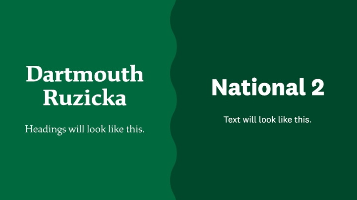
Until recently, several different typefaces were used on Dartmouth’s websites. Most text will now appear in a font called National 2. Headlines will be spelled out in a typeface called Dartmouth Ruzicka, which was created for the College in 2018, along with an updated Dartmouth wordmark.
Dartmouth Ruzicka is based on the work of the late Rudolph Ruzicka (1883-1978), a typeface and book designer and longtime resident of Hanover who did design work for Dartmouth in the middle of the 20th century. His book Studies in Type Design was published by the Dartmouth Library in 1968. Dartmouth worked with a typeface designer who modified the original Ruzicka to give it a more contemporary look.
Ruzicka has serifs—tiny flourishes that finish off letters. (Some historians date serifs to Roman inscriptions carved into stone, replicating brush marks.) Many contemporary typefaces, including National 2, do not have serifs, to enhance readability; they are known as sans serif fonts.
Jon Chiappa, senior director of Web Services in Information, Technology and Consulting, says Ruzicka and National 2 work well together to let readers know that they have arrived at an official source of Dartmouth information.
“It gives people confidence that they’ve come to the right place without being aware of the typeface,” says Chiappa.
And what does a typeface “say” stylistically about the school it represents? Chiappa says Ruzicka strikes a traditional note, honoring Dartmouth’s long history.
“Typography is another step in our ongoing effort to present a cohesive community—not only to the world, but also to ourselves,” says Chiappa. “We are proud of our past, and we are actively looking to the future.”
Charlotte Albright can be reached at charlotte.e.albright@dartmouth.edu.
